Contest: Win a book & DVD including loads of hi-res textures
Posted by Vincent in Textures | 67 comments
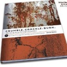
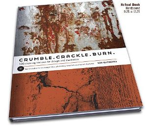
Let’s start the new week with a big bang, shall we! I am giving away a free copy of the texture book Crumble, Crackle, Burn by R. von Glitschka. All you have to do is leave a comment on this post and suggest an improvement, which you would like to see on this blog in the future. A random number generator will determine the winner amongst all valid entries. Only one comment per person is allowed. Comments like “I want the book!” or “me pleeeeease” will not count as valid entries, so try to post realistic improvement suggestions. Please leave a valid email address when posting a comment, so I can contact you in case you are the winner.
This contest will run until monday 29th of september 23:59 h CET. The winner will be announced the day after that. You don’t have to worry about shipping costs, as they are already included in the price.
For more information about the book and the DVD, please visit the official website.
The texture packs are fantastic, and the black background with white text is very readable.
You know, I’ve been subscribed to this blog since almost the second post, so I really appreciate what you do. One thing I’d love to see more of, is analyzing different ways that textures work for us in our design. There’s a difference between Elliott Jay Stocks’ website and the One Fast Buffalo website, but both use texture exceptionally well. That’s all. 🙂
Hio!
A new logo, some center aligning as Jacob mentioned it, and content. A lot of juicy content.
Tutorials would be the best, there is a lot of way to creating stunning textures.
Another idea is: tell people, how to use theese textures well. How can they communicate with them, and bring some examples.
Got your feed 😉
good luck
Cya
It would be nice to see some tutorials on creating your own textures, or maybe how to transform your images into textures.
First, this is a very nice site with lots of wonderful content.
As a suggestion, I have to say that on each page of this site, there is too much clutter. The theme is simple, yet there are too many text boxes and colorful links. I am a minimalist, and I try to organize my websites so that things are easy to find and the read isn’t distracted by unnecessary clutter.
Perhaps maybe an easier way to scroll through all images? A gallery function maybe? Tutorials are always appreciated.
oh heavenly daze! I just came across you when I needed it most. Talk about breaking the creative log-jam! thank YOU.
As for advice? hmmmmmm. not much on the font you utilise for your title….but that’s being nitpicky.
thanks again!
Hello. I really enjoy reading your article. There are many questions that I have. I will be emailing you soon. Please expect an email from me jason(at)test.com
Thanks for your blog. One of the better blogs I’ve seen. Do you mind if I shoot you a short email about your design? I’ve included my address in the field if you could give me a second.
lol i love contest i hope this one is still on
Hey Highresolutiontextures,
Thanks for your thoughts, Who doesn’t want their kids to win a cutest baby photo contest! All parents think their kid is the cutest and rightly so! And you, like thousands of other parents, think your baby is the cutest one. Baby photo contests are a great tool for you to give your kids an easy and fun way to get into modeling industry, while giving yourself a chance to win some free prizes.
Kindest Regards
Please, make available custom web styles/themes. This almost black textboxes on this black background are practically invisible.
Thank you and best regards.
want to see some textures from ink and water
This really is the fourth posting, of your
site I personally read through. Still I enjoy this 1, “Contest: Win a book & DVD including loads of hi-res textures | High Resolution Textures” the very best.
Take care ,Agnes
Incredible! This blog looks just like my old one! It’s on a completely different topic but it has pretty much the same layout and design. Superb choice of colors!
Hi, I think your blog might be having browser compatibility issues.
When I look at your website in Safari, it looks fine but when opening
in Internet Explorer, it has some overlapping.
I just wanted to give you a quick heads up!
Other then that, great blog!
I am just now building my first website. One the page with the snow and Christmas, I really liked the font that you used. If maybe you could say what fonts are used on the example. GREAT website. Thank you so much for everything you have done. Greatly appreciated.